Intro
Appliance Repair Marketing provides a dashboard for their clients to track their calls and observe what customer experience the are providing over the phone. However, the old design was hard for appliance repair businesses to user and understand. I created a better user experience and a stronger visual appeal. I used charts and graphs that were simple and easy to understand, tested among several random people, and used ARM’s brand guideline to keep the company look alive. Below you will see the old customer dashboard and my new design.
Services
User Interface Design
Clients
Appliance Repair Marketing
Before
The old client dashboard that lacked the certain functionality and user experience that we desired for our clients. Statistics were not being read correctly, and many clients gave negative feedback that it was difficult tell what the graphs even meant.
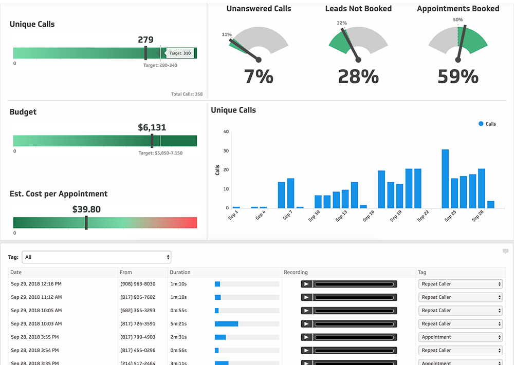
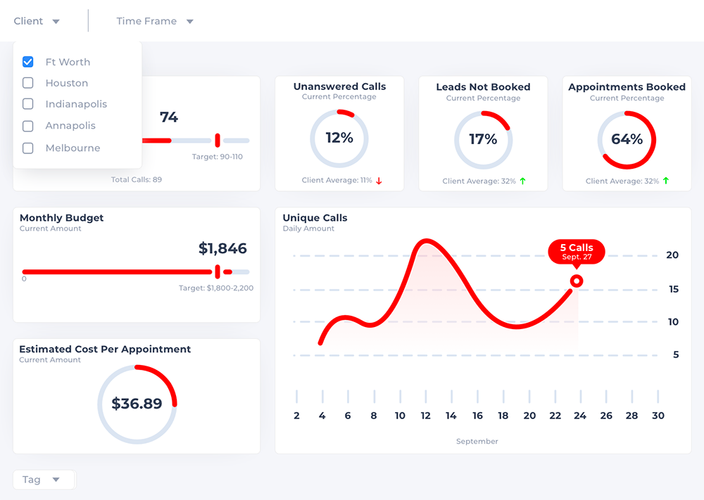
After
The new dashboard that offers excellent functionality and a beautiful user interface. The client feedback suggested that statistics could be clearly interpreted, and it was much easier to navigate.
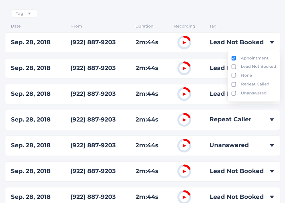
Before
This section of the dashboard allowed business owners to track how their employees were answering their phones, and even let them listen to the recordings. However, many of our clients had trouble with things like starting and stopping the audio, selecting different dates, and the labeling the type of caller they were listening to (repeating, appointment booked, ect.).
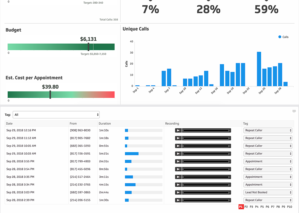
After
The new dashboard offers a beautiful user interface while also enhancing functionality. The key here was to simplify the dashboard for the customer so they could easily accomplish exactly what they needed to.